Why Responsive Design Matters for Chefs
Kitchen, devices vary:
-
Tablets in prep areas for quick data input
-
Desktops in offices for detailed reports and ordering
-
Mobile phones for quick counts while moving between storage areas
Design Decision:
Bread was built as a responsive web app, ensuring usability across devices:
-
Mobile: One-handed use for quick counts
-
Tablet: Mid-service updates and accessibility in tight spaces
-
Desktop: Data-rich reporting and bulk edits
This approach meets chefs and owners where they already work, without forcing a one-size-fits-all workflow.
Outcome
Users who reviewed the prototype said the streamlined approach would save them valuable time, especially for weekly or monthly inventory counts. Requested features like low-stock alerts and real-time updates align with Bread’s planned feature roadmap.
Takeaways
Add paragraph text. Click “Edit Text” to update the font, size and more. To change and reuse text themes, go to Site Styles.

Bread
Inventory Management App
A streamlined digital experience that saves time and sanity in the kitchen.
From Kitchen
Chaos to UX Clarity
Before I was designing user flows, I was managing kitchens. I knew the pain of taking inventory at 2AM after a long shift. That frustration led to the creation of Bread, a tool built to make inventory simple, fast, and less soul-sucking.
Role: Product Designer
Duration : 6 Weeks
Scope: Research, Wireframes, Prototypes, UX/UI
Tools: Figma, FigJam, Google Forms, Adobe Suite
User Personas


Problem
Discovery
Inventory is still mostly a manual, error-prone process. In my survey of small food businesses:
-
60% still use pen and paper to track inventory.
-
Satisfaction with current methods averaged only 3/5.
-
Common pain points included:
-
“Knowing exactly what I need for the week and how much.”
-
“We go through a lot of a little because of all the programs.”
-
“I would love to track exactly how much I’m using vs. what I’m buying.”
-
-
Despite frustrations, 80% of respondents said they would adopt a new digital inventory solution if it saved time or reduced errors.
Participants were also comfortable with technology (4–5/5 comfort level using apps), meaning the barrier isn’t digital literacy—it’s outdated tools.
Requested features aligned with Bread’s vision:-
Low stock alerts
-
Expiration tracking
-
Real-time updates
-
Vendor integration
-
Save Time, Reduce Stress
-
Reduce the time required to complete inventory
-
Minimize errors from manual entry
-
Adapt to different work environments (mobile in storage rooms, tablet in prep areas, desktop for analytics)
-
Integrate with existing workflows and POS systems
-
Listening
to the Line
Before designing, I conducted a survey and interviews with food business operators, including restaurants, bakeries, and a culinary school.
These findings validated the pain points and goals outlined earlier, providing detailed insight into how chefs currently work and what features they need most.
Key Insights
-
Manual processes dominate: 60% still rely on pen and paper.
-
Satisfaction is low: Average rating of 3/5, with some as low as 2.
-
Top frustrations:
Unclear par levels
Disconnected workflows across multiple programs
No real-time visibility for teams
-
Openness to change: 80% willing to try a digital solution.
-
Most requested features: Low stock alerts, expiration tracking, vendor integration, and real-time updates.
-
Comfort with tech: Most participants rated 4 or 5 out of 5 for using mobile or software tools.
I would love to track exactly how much
I’m using vs. what I’m buying.

Jamal
User Pain Point
Knowing exactly what I need
for the week and how much.

Claire
User Pain Point
List vendors and price and
cut-off time for each order.

Maria
User Pain Point
From Whiteboard to Walk-In


Sketching out the process
helped me reimagine the inventory flow from a chef’s perspective one-handed use, logical zones, and quick saves for those mid-count interruptions.


Journey Mapping:
Focused on reducing interruptions and allowing inventory to be paused/resumed.

Wireframes:
Mobile and tablet flows prioritized for one-handed use and quick navigation.

Low-Fidelity Prototype:
A clean, kitchen-friendly interface with large tap targets and logical grouping (walk-in, dry storage, freezer).
The Solution
Add paragraph text. Click “Edit Text” to update the font, size and more. To change and reuse text themes, go to Site Styles.
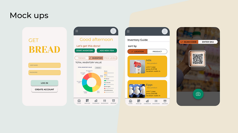
Key Features
-
Responsive Layouts
-
Area-based inventory
(walk-in, dry, freezer)
-
Quick count inputs
-
Save & resume progress
-
POS integration or manual mode
-
Summary reports for staff/owners

